Color accuracy plays a vital role in artwork photography, ensuring that the artist’s intended vision is faithfully represented. Accurate colors allow viewers to connect with the artwork, experiencing it as the creator intended. Photographers must understand color accuracy to preserve the emotional and aesthetic qualities of their subjects. Factors such as camera calibration, color spaces, and consistent light conditions directly impact the final image quality. A professional photographer must prioritize this accuracy in both capture and editing. This commitment not only enhances the viewer’s experience but also upholds the integrity of the art itself.
Understanding Color Accuracy
Color accuracy refers to how closely the colors in a photograph match the true colors of the original artwork. This concept is crucial for photographers aiming to represent art authentically. Accurate color reproduction ensures that the viewer perceives the piece as the creator intended. Achieving this requires knowledge of various factors, including lighting and camera settings.
Different color spaces, such as sRGB, AdobeRGB, and ProPhoto RGB, significantly influence artwork reproduction. Each color space offers a different range of colors, or gamut, impacting how images appear on different devices. AdobeRGB and ProPhoto RGB provide a broader gamut compared to sRGB, making them suitable for high-quality reproduction, especially in giclée printing services. Choosing the correct color space during the capture and editing process is essential to maintaining quality.
Calibration of both cameras and monitors plays a pivotal role in achieving consistent color representation. Cameras need to be correctly set up to accurately capture colors, while monitors require regular calibration to ensure they display colors correctly. Without these adjustments, discrepancies can arise between the original artwork and its photographic representation. Photographers must prioritize calibration to maintain alignment with the artist’s vision.
Color accuracy is not just technical; it also affects how art is perceived by audiences. When colors are inaccurately represented, viewers may be misled about the artwork’s characteristics, undermining the artist’s intent. This is particularly harmful in galleries and museums where fidelity to the original work is paramount. Maintaining color integrity builds trust with audiences, thereby enhancing the overall art experience.
Art photographers must adopt techniques that support color fidelity throughout the entire process. Effective lighting, the choice of background, and precise camera settings all contribute to achieving true-to-life colors. Incorporating post-processing tools is also vital, as they can aid in correcting color discrepancies that arise during capture. Utilizing color reference tools, such as color checkers, adds an extra layer of precision, ensuring that the photographer honors the artist’s work.
The Importance of Color Accuracy in Artwork Photography

Inaccurate colors in artwork photography can significantly mislead viewers regarding an artist’s intent. When colors deviate from their true representation, the emotional impact of the artwork may be diminished, causing a disconnect between what the artist envisioned and what the audience perceives. This misrepresentation affects not only individual interpretations but also the overall credibility of the art presented in galleries and museums. Maintaining true color fidelity is essential for establishing trust with viewers, ensuring that they appreciate the artwork in its intended form.
The significance of color accuracy extends to online art portfolios as well. Artists and photographers alike rely on consistent color representation to reach a wider audience online. Inaccurate images may result in lost sales opportunities or diminished interest in an artist’s work. Ensuring that every piece looks its best requires strict adherence to color accuracy standards and practices, making it an essential focus for any professional photographer in the field.
– Accurate colors enhance viewer experience, allowing a deeper emotional connection with the artwork.
– Misleading colors can alter the public perception of an artist’s intention, effectively changing the artwork’s narrative.
– Consistency in color representation strengthens the overall brand and trustworthiness of galleries and artists.
– The digital landscape demands attention to detail, especially when presenting art online, to avoid misrepresentations.
– Color accuracy plays a critical role in giclée vs traditional printing decisions, affecting the quality of final prints and reproductions.
Understanding color accuracy also helps photographers develop their skills. By prioritizing this aspect, they improve their art reproduction techniques, resulting in a polished final product. This commitment benefits both the artist’s reputation and the photographer’s professional standing. Ultimately, dedicated practices surrounding color accuracy elevate the effectiveness of artwork photography, ensuring that it resonates with its audience as intended.
Techniques for Ensuring Color Accuracy
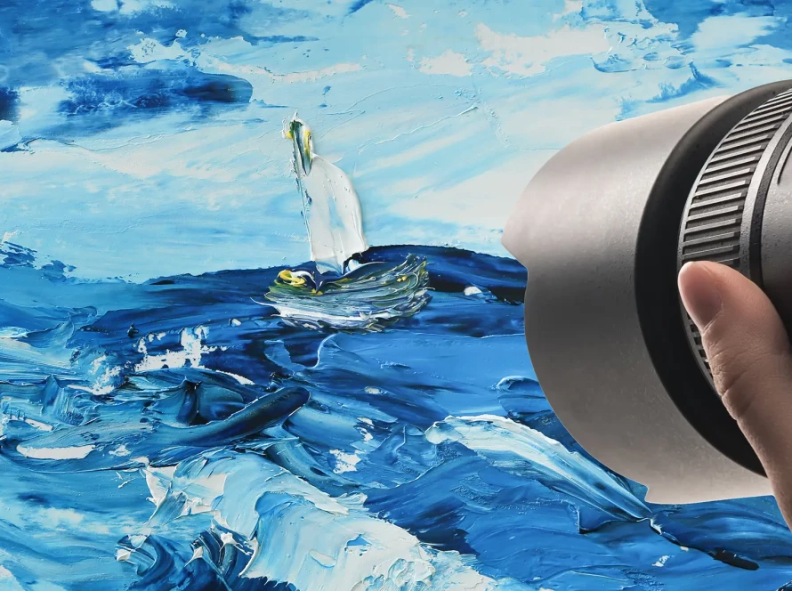
Capturing accurate colors during the photography process begins with proper lighting. Natural light is often the best choice, as it provides a broader spectrum of colors. Avoid using harsh artificial lights, which can produce unwanted color casts that distort the true appearance of the artwork. The background also plays a critical role; selecting a neutral backdrop minimizes distractions and helps the colors of the artwork stand out more vividly.
Careful camera settings enhance color fidelity as well. Adjusting the white balance correctly is essential for accurate representation. Different lighting conditions require different white balance settings to ensure the camera captures the true colors of the piece. Utilizing a consistent aperture and shutter speed also contributes to maintaining color integrity throughout the photographic process.
Post-processing tools like color correction software are invaluable for enhancing color accuracy. These tools allow you to adjust colors precisely and correct any discrepancies caused by lighting conditions or camera settings. Software such as Adobe Lightroom or Photoshop can help restore artwork colors to their original vibrancy. Understanding how to use these tools effectively elevates the overall quality of your artwork photography.
Color reference tools like color checkers are also effective in ensuring precise color reproduction. By taking a reference shot with a color checker in the frame, you can later use it in post-processing to calibrate the colors accurately. Professional photographers often include this practice in their workflow, as it provides an essential point of reference. Such measures significantly improve the reliability of color representations, giving viewers an experience closer to the original artwork.
Focusing on color accuracy benefits both artists and photographers alike. For artists, maintaining accurate colors is crucial for fine art printing services, ensuring that reproductions honor the original vision. Photographers also gain professional credibility when they prioritize fidelity in their work. This shared commitment to authenticity enriches the relationship between the artist and audience, ultimately enhancing the appreciation of the artwork.
The Final Brushstroke
Achieving accurate color in artwork photography is vital for honoring the artist’s intent. You create a more authentic experience for viewers when colors are true to life. This accuracy plays a significant role in maintaining integrity, especially in digital vs. traditional printing processes. Reliable representation fosters trust and appreciation among galleries and audiences alike. By employing effective techniques and leveraging color management tools, photographers can elevate their work and ensure every image resonates with its original vibrancy.